|
|
Post by hawksmoor on Dec 4, 2015 20:27:58 GMT -5
|
|
|
|
Post by The MRP! on Dec 5, 2015 3:11:37 GMT -5
I would just use a better image for Cassie than the infamous death threat causing, CBR forum destroying Teen Titans #1  -M |
|
|
|
Post by The MRP! on Dec 5, 2015 3:15:00 GMT -5
If I ever were to do a League story, it would likely be with the very early Giffen/DeMAtteis/Maguire line-up...  I've had a story kicking around in my head for that group since high school  But I like your line up for the most part, (if not the images you chose for some of the incarnations). But again, it all comes down to execution. -M |
|
|
|
Post by hawksmoor on Dec 5, 2015 5:18:19 GMT -5
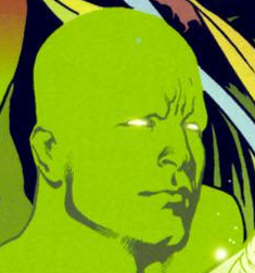
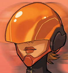
Ha. I figured as much - Personally? I love Electric Blue Superman, and this is a sort of "Ultimate" take, so I'm going with a more...I don't know? modern type incarnation? I figured in 2015, if Batman existed, it'd be a sort of battle armour kind of look, not wearing some Lycra and a spear gun. Similarly, I REALLY LOVE the art of Eric Canete. Also, why do you think I chose that image of Cassie?  I do really enjoy the art of Rocafort. I know he is very anatomically incorrect (and I think, in some circumstances thats sort of expected. Bachalo doesn't get the same criticism for being anatomically incorrect, because it's a style. BUT ANYWAY) That isn't the full lineup - I'm hoping to go into more detail about it later on but thought I'd drop a little bit and see what people thought. |
|
|
|
Post by The MRP! on Dec 5, 2015 15:06:18 GMT -5
I think the difference is that Bachalo is obviously impressionistic in his style while Rocafort tries to look photorealistic and the parts of his anatomy that he exaggerates seem intentionally exploitative because of it. With Bachalo everything from backgrounds to poses from men to women to animals to cars to buildings are all exaggerated for style, with Rocafort, the backgrounds are in realistic style, the men are slightly exaggerated but the woman only have certain parts exaggerated and usually in broke back poses. SO I thinks it's apples and oranges. Bachalo's style is comprehensive and it's not just his anatomy that gets exaggerated or is unrealistic. With Rocafort is only certain elements that get exaggerated and realistic so it seems a choice to focus on those elements, hence the flack.
-M
|
|
|
|
Post by The MRP! on Dec 5, 2015 15:43:38 GMT -5
If you've never read Understanding Comics by McCloud, or seen his chart of the scale of art as symbol, this might be interesting to you...  all art is representative, i.e. symbol, but it varies how close to reality it hews. Someone like Bachalo or Mignola have a place on this chart and their art is consistent in that place. Rocafort's art seems to be all over the chart within the same piece, which is why he doesn't get a pass for it being a style while others do. -M PS here's a direct link so you can see it bigger if you want to... larger version |
|
|
|
Post by hawksmoor on Dec 6, 2015 17:11:39 GMT -5
Just out of interest, what pictures do you dislike? Also, rounding out my "Justice League" is; Lantern (Simon Baz) Flash (Jessica Flash (Jessica Quicke ) Aquaman (Jackson Hyde) and Aquawoman (Lorena Marquez) Aquaman (Jackson Hyde) and Aquawoman (Lorena Marquez)  More info to follow, but I just wanted to present it as a whole thing. I'd defo like to do a short story or something based on these guys as the world's premier heroes, each inhabiting different "genres", I guess. (It's Super hard to get a really good image of the new Aqualad. Such disappointment.) Where I am coming from with this is I saw on Project Rooftop, called Marvel Supreme. Where the world was slightly more representative of the world at large, rather than being 98% White American. Even still, my casting isn't that None White-Racially diverse, but I have ideas for other characters to take part in the team and really make it a world team rather than just America. Still! That is it for the time being. Like I said, I'd like to write a short story, at least, for this time...perhaps their first adventure, perhaps just a single adventure. Who knows. |
|
|
|
Post by The MRP! on Dec 6, 2015 21:32:09 GMT -5
Of the images you posted, the only one I don't like is the cover of Teen Titans #1 (the Cassie image). I didn't like it when I first saw it, I liked it less after all the hoopla and vitriol it engendered. I thought it was a bad piece of art that brought out the worst in a lot of people.
Other than that, my artistic tastes range pretty wildly.
-M
|
|
|
|
Post by hawksmoor on Dec 7, 2015 17:17:38 GMT -5
Fair enough, that seems like a legit reason. I actually really like Rocafort, I think his art has a nice sort of..Animeish tinge to it, and I really enjoy the scratchy lines. His work on Hunter/Killer was awesome. Put me in mind of like a Michael Broussard.
Actually, there was a definite Top Cow House Style for a bit. It seems to have followed the image route and diversified significantly.
|
|